
 Langkah pertama dalam dagangan
Cara carta lilin berfungsi dan tempoh masa yang hendak dipilih
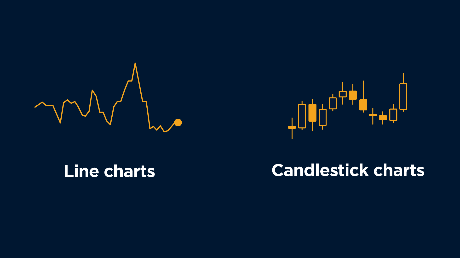
Terdapat dua jenis asas carta yang boleh didapati dalam Forex: Garis dan Lilin Jepun. Mari lihat lebih dekat pada kedua-duanya.
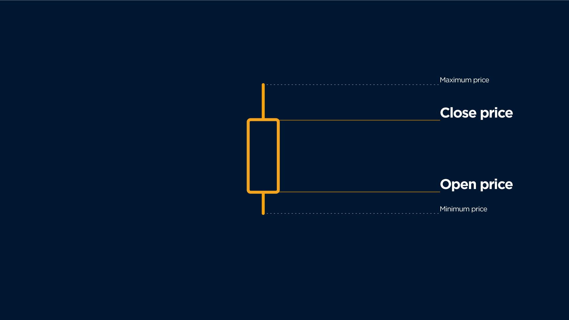
Satu lilin Jepun secara asasnya ialah carta linear yang menggambarkan harga untuk rangka masa yang dipilih tetapi menunjukkan bentuk yang lebih padat.
Lihatlah bagaimana carta linear yang menggambarkan harga yang meningkat ditukar kepada lilin Jepun lima minit berwarna putih.
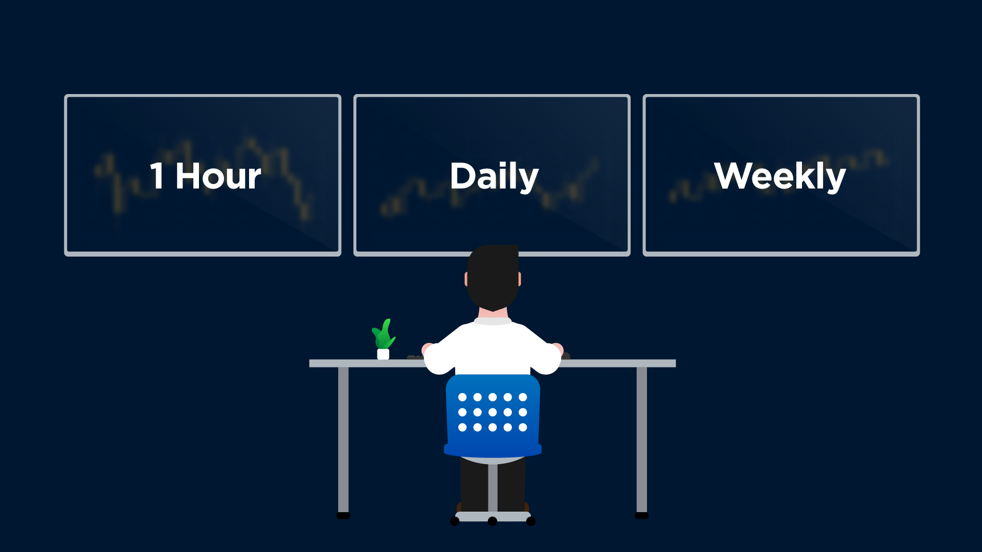
Pedagang menggunakan rangka masa bulanan, mingguan, harian, 4 jam, setiap jam, 15 minit dan juga 1 minit.
Secara idealnya, pedagang memilih rangka masa utama yang mereka berminat dan kemudian memilih rangka masa yang lebih lama dan lebih singkat untuk melengkapi rangka masa utama.
Rangka masa yang lebih lama biasanya mengandungi isyarat yang kurang dan lebih dipercayai. Rangka masa yang lebih singkat biasanya mengandungi lebih banyak isyarat dengan ketepatan yang kurang.
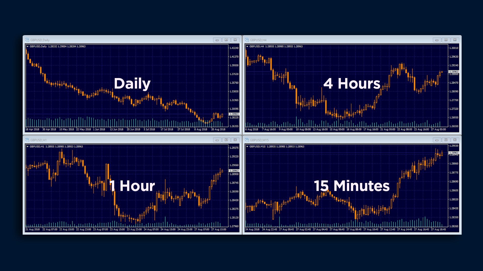
Pedagang intrahari yang memasuki dan keluar daripada pasaran pada hari yang sama memberikan lebih perhatian pada rangka masa yang lebih singkat, seperti carta setiap jam dan 4 jam untuk isyarat masuk dan carta harian untuk trend yang lebih meluas.
1. Anda boleh menggunakan carta garis untuk membuat analisis antara pasaran, tetapi anda seharusnya menggunakan carta lilin untuk menganalisis harga simbol yang anda dagangkan.
3. Gunakan rangka masa yang lebih besar untuk mencari garis sokongan dan rintangan yang kuat atau trend dan yang lebih kecil untuk membuat keputusan akhir anda

Dalam pelajaran yang seterusnya, anda akan belajar:
-
tentang kos yang dihadapi oleh pedagang apabila berdagang Forex
-
tentang spread
-
tentang swap dan cara mengelak daripada membayarnya apabila anda berdagang semalaman
-
tentang helah yang digunakan oleh broker dan yuran yang anda tidak perlu bayar
Welcome to the fourth lesson of our Forex Basic Course.
In this lesson, you will learn:
-
what the most common types of charts are
-
how to read a Japanese Candlestick chart
-
what timeframe to choose to understand market movements better and make more realistic forecasts.
Types of charts
Charts of different types are used for analysing changes of the price and forecasting future trends in Forex. The charts are created Y-axis of the chart represents a price and X-axis of the chart represents a timespan. Line charts and Japanese Candlesticks are the most commonly used in Forex. Let’s have a closer look at them both.
Line charts
Line Charts are the simplest, as they only connect closing prices over a given time period and depict the general price trend.
You can use this type of chart as an overlay or for comparing charts when performing an intermarket analysis. For example, you might compare the prices of the Australian dollar and gold using a line chart.
Line charts can additionally be used for determining support and resistance levels and searching out various patterns.
Candle charts
Japanese Candlesticks offer the most popular form of charting. The candle chart bears much more information than the line chart. Japanese candlestick explicitly represents the market environment.
Japanese Candlesticks include two parts: a body and a shadow. The body marks the area between the open and the close price. If price closes above the open, the body is hollow. If price ends up closing lower, the body is solid.
The narrow line - called a shadow - shows the price range for the set time period.
The hollow candle is referred to as white, and the solid candle is called black, though in reality, the chart can be shown in any color.
One Japanese candlestick is basically a linear chart representing a price for a selected timeframe but shown in a more compact form.
What timeframe to choose to understand market movements better and make more realistic forecasts
Traders use monthly, weekly, daily, 4-hour, hourly, 15-minute, and even 1-minute timeframes.
Ideally, traders pick the main timeframe they are interested in, and then choose a longer and a shorter timeframe to complement the main one.
The longer timeframes typically contain fewer and more reliable signals.
The shorter timeframes usually contain more signals with less accuracy.
There are several types of traders, and they have different trading styles.
Swing or position traders prefer holding trades for days or weeks. They mainly focus on the daily charts for their trades. They can also make use of a weekly chart when defining the long-term trend. They track a 4-hour chart when defining the immediate short-term trend.
Intraday traders, who enter and exit the market the same day, pay more attention to shorter timeframes such as the hourly and 4-hour charts for entry signals, and the daily chart for the broader trend.
Let’s summarise what we’ve learned from this lesson:
-
You can use the line chart to make an intermarket analysis, but to analyse the price of the symbol you’re trading you should use the candle chart.
-
The candles can be of two colours: white (bullish) where the closing price is higher than the opening price, and black (bearish) where the closing price is lower than the opening price.
-
Use bigger timeframes to find strong support and resistance lines or a trend and smaller ones to make your final decision.
In the next lesson, you will learn:
-
What the costs a trader faces when trading Forex are.
-
What a spread is.
-
What a swap is, and how to avoid paying it when you trade overnight.
-
What tricks dishonest brokers use, and what fees you don’t need to pay.